Featured Projects
Explore a diverse range of data visualization projects, from interactive web dashboards to mathematical art.
 Data Analysis
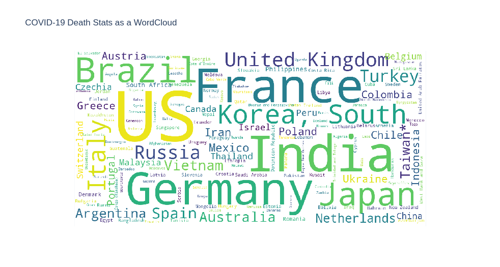
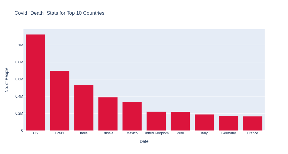
COVID-19 Analysis — Matplotlib
Static visualizations of global COVID-19 data using Matplotlib. Features word clouds of death cases, country-wise comparisons, bar charts of top 10 affected countries, and trend line graphs.
 Data Analysis
COVID-19 Analysis — Plotly
Interactive visualizations of COVID-19 data using Plotly. Compare confirmed cases, deaths, and recoveries across countries with interactive hover tooltips, zoom, and pan capabilities.
 Streamlit App
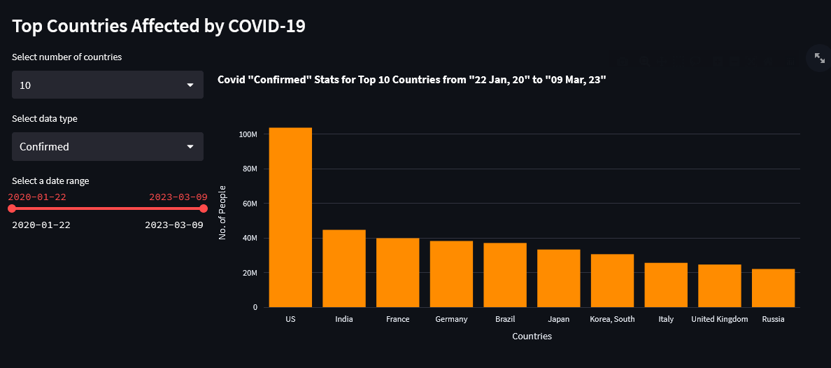
COVID-19 Interactive Dashboard
A live Streamlit web application for exploring COVID-19 data interactively. Features dynamic filtering, multiple chart types, and real-time country-wise analysis.
 Streamlit App
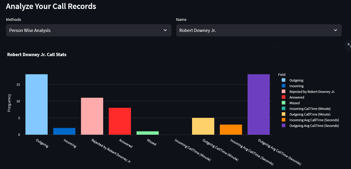
Call Log Analysis
Interactive Streamlit dashboard analyzing phone call data. Visualize person-wise call patterns, peak call hours, and the balance between incoming and outgoing calls.
 Streamlit App
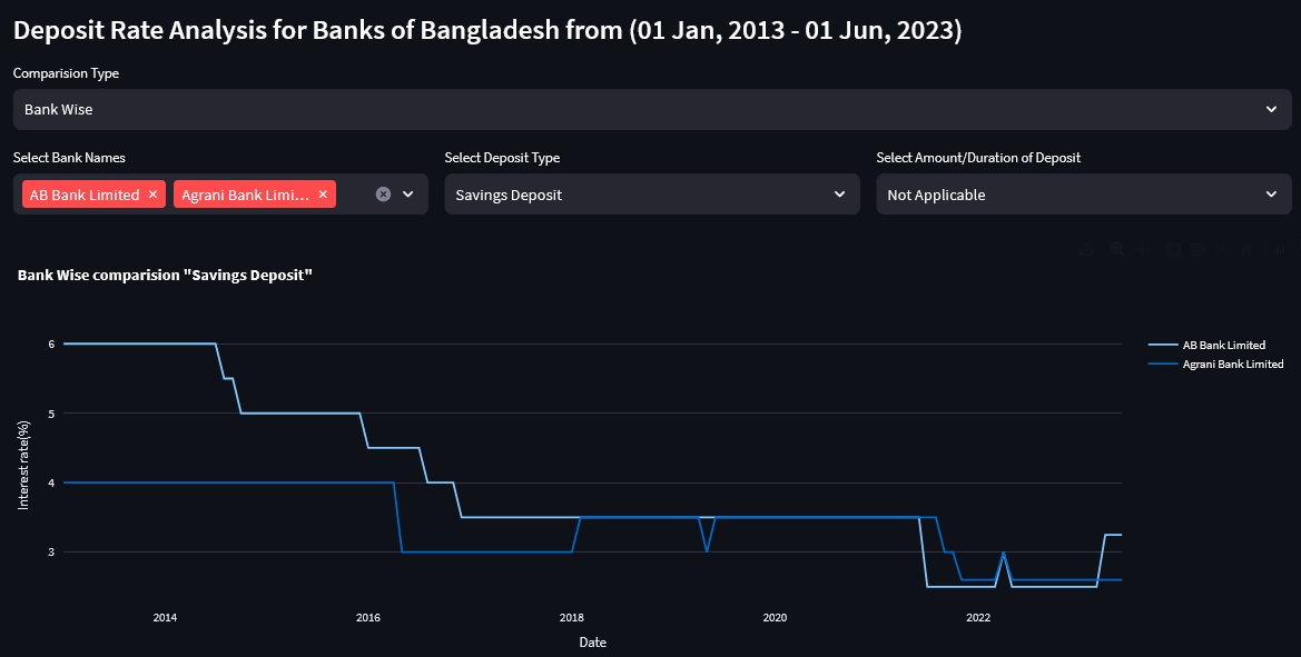
Bangladesh Bank Deposit Analysis
Interactive analysis of deposit rates across Bangladeshi banks. Compare bank-wise and deposit-type trends with dynamic line charts and filtering capabilities.
 Data Analysis
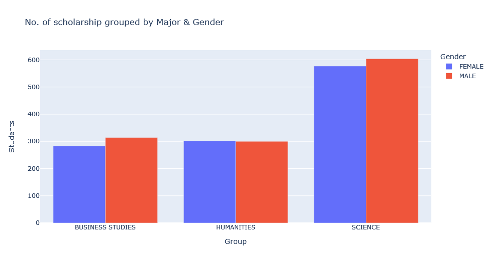
SSC Scholarship 2023
Data extraction from PDF documents and statistical visualization of SSC scholarship distribution. Analyzes top 200 scholarship recipients and overall statistics.
.png) Data Analysis
Data Analysis
KUET Student Gender Ratio
Web scraping and visualization of student gender demographics at KUET university. Department-wise breakdown showing the percentage distribution of boys and girls.
 Mathematical Art
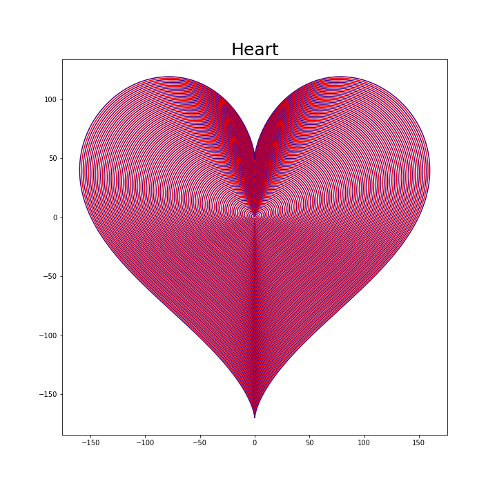
Matplotlib 2D & 3D Art
Mathematical art created with Matplotlib. Includes a parametric heart curve, 3D normal distribution surface, prime number spiral patterns, and randomized sine wave compositions.
 Mathematical Art
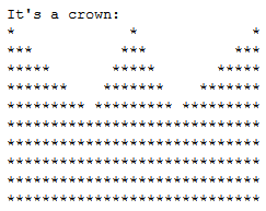
Geometric Shapes
Algorithm-driven geometric pattern generation. Creates intricate shapes like crowns, triangles, squares, and rectangles using mathematical coordinate plotting.
 Utility
Progress Bar
A custom terminal progress bar utility with visual indicators. Displays real-time progress tracking with percentage completion and animated bar visualization.